02/LAPL
Client
LAPL
Service
Mobile App Redesign
Deliverables
Research, MVP, Style Guide
Team
Rob Eisenbach
Tyler Gates
Natalie Woo
Timeline
2.5 week agile sprint

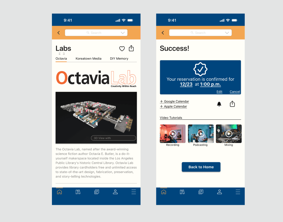
The primary goal of this project is to enhance the Los Angeles Public Library's mobile application, focusing on improving accessibility to information and resources. The redesign aims to highlight avant-garde offerings, particularly Octavia Labs, a collection of recording studios and tech gadgetry available for rent. Additionally, the project aims to attract more individuals to the library by creating a seamless user experience.
Streamlined Navigation
Prioritize intuitive and user-friendly navigation to facilitate easy access to library services, resources, and information
Implement a clear menu structure that allows users to quickly find relevant sections, including Octavia Labs and other innovative resources.
Avant-Garde Section Highlights
Design a prominent section within the app to showcase avant-garde resources such as Octavia Labs.
User Onboarding
Develop a seamless onboarding process to guide new users through the app's features and benefits.
Implement a tutorial or walkthrough to introduce users to key functionalities, including how to explore and utilize resources.
Research and Define
Methodologies
My team decided to focus on redesigning the Los Angeles Public Library's mobile app for its enthralling Octavia Labs, a series of recording studios for music, podcasts, and technology studios. The tech studios offered gadgets such as 3-d printers and circuit board makers. What was essentially born from this idea was a way to attract what we called “makers”, or individuals who are looking to expand their creative passion in a discipline.
11 user interviews were conducted, in which "library gurus", or frequent visitors, non-library users, and creative professionals called "makers" were all interviewed, as well as those who work at the Denver Public LIbrary.
The main focus of developing an app for a library was to revitalize the purpose of libraries. While libraries still remained an object of affection and nostalgia, some users also noticed negative connotations of libraries, suggesting that their impression lied in it being “old”, “dusty”, and “dated”.
Libraries offer a plethora of resources that I personally was not aware of, with some objects stranger than others. The Arlington, VA Public Library offers American Girl dolls for rent, while the Santa Barbara Public Library offers a “Library of Things” in which memory kits are provided for individuals with Alzheimer’s. While some libraries offered fun and useful tools - such as a cheese warming kit, a mochi maker (which I would personally love to use), and a tortilla press, there were also health-related tools that libraries offer that could help improve someone’s life. Such examples could be blood-pressure cuffs, color-blindness glasses, and toolkits to improve health literacy.
C v. C Analysis
Applications Analyzed
Apps with strong navigation (Peloton, Venmo)
Library Apps (NYPL, SDPL)
Conclusions
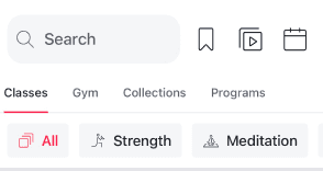
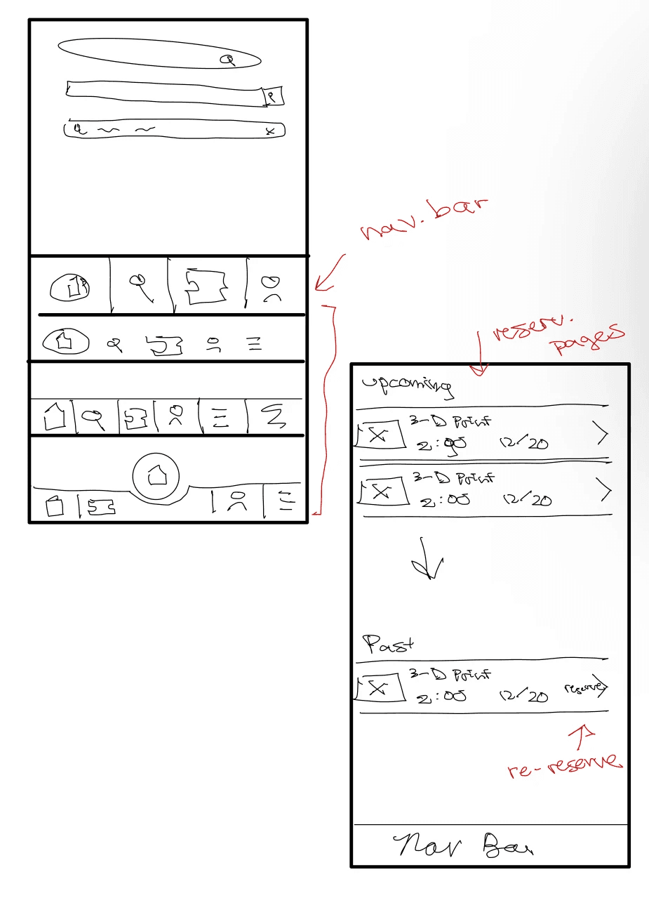
Many applications use tertiary navigation
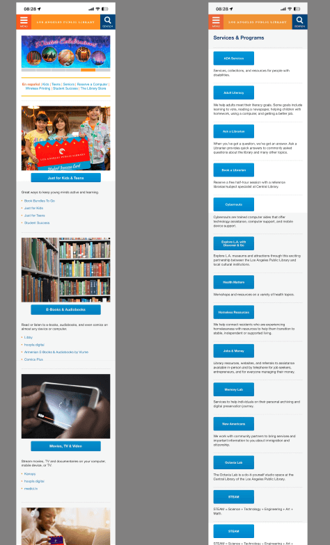
Current public library UI is difficult to navigate, and does not provide sufficient information.
Strong use of iconography helps to make an interface more intuitive.
Small nav elements, were analyzed to gauge how to best prioritize information.
II. Synthesis
Library users had fond memories of libraries from their childhood and often felt strongly that libraries needed to be maintained as they remain a pillar of the city. They also skewed appreciation for libraries offering free resources to the underserved, as well as services, despite not knowing specific services offered. Our library users also felt that online tools from the library were disorganized and not very functional.
Library non-users, in contrast, believed libraries to be dusty and outdated, but still good hubs to study because of its quiet atmosphere. Library non-users tend to be young adults who tend to have negative connotations from their childhood, and often see libraries as places for studying and being productive.
Makers are passionate about having shared community spaces that have artistic spaces, as well as are generally interested in the avant garde resources that libraries offer. They, however, would overall an individually curated space where they have access to personal resources and high-tech gadgetry.


When building out our persona matrix, we measured 4 vertices, makers v non makers, library users v non library users. Of the 11 users that we polled, our personas were conglomerations of 3 personas each, with the first persona being a library enthusiast who consumes media, and the second a semi-library enthusiast who is a maker.

Problem Statements
Katrina needs a better way to discover how to engage with her new local library because she just moved to the city and doesn’t know how to plug herself into it.
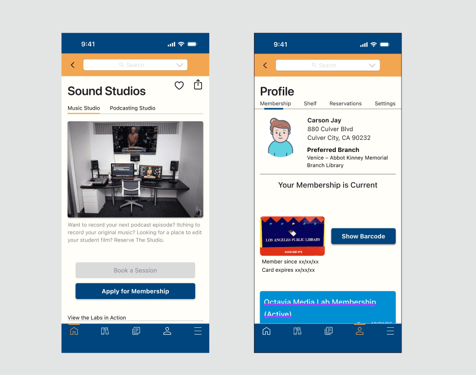
Constrained by a lack of funds, Carson needs a cost-friendly and accessible space to record and produce his music in a manner that approaches the quality of the studio experience that he’s accustomed to.
The Solution
Create a new app for LAPL with streamlined navigation, user personalization, and more accessibility than their website offers in order to create more transparency of library services and further modernize the library experience.
III. Sketching and Ideation
Our application followed ios HIG conventions, meaning that there would be a level of intuitiveness that will be recognizable to users. These elements, such as margins, typography (SF Pro), and iconography were all essential towards establishing recognizable design elements that would make a user's experience much more seamless.

Sketching
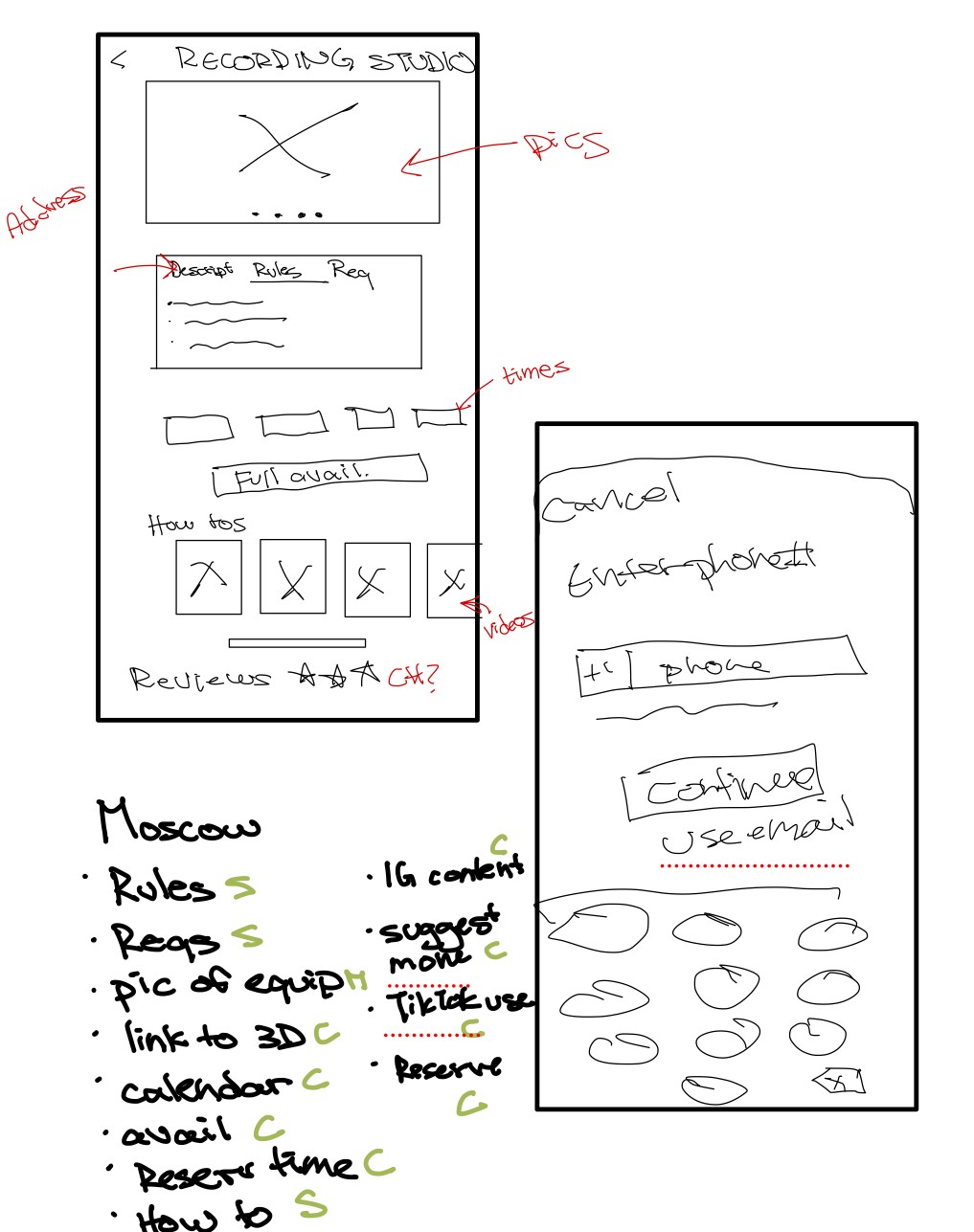
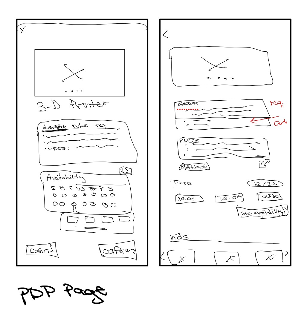
Our process for sketching mostly focused on prioritizing information architecture, as library's have a plethora of resources and information to provide to the public. We were met with a series of open-ended questions surrounding what information a user would want accessible on the application, in what order, and in what presentation.

Information Architecture
In order to tackle the aforementioned questions, a great deal of analysis of both competitors and comparators was conducted. Peloton, which has tertiary navigation, has an intuitive level of information presented so as to no overwhelm the user, but also makes a very simple UI that allows its users to easily find what is needed. We believed that mimicking several levels of information in a visual hierarchy would be the simplest way of presenting necessary information.
IV. Mockups and Prototyping
V. Usability Testing and Next Steps
The initial assessment identified navigation issues with a consensus that it lacked intuitiveness in the user flow. Suggestions were made for small UI design tweaks, encompassing adjustments in color, contrast, and typography weight. Additionally, confusing iconography was highlighted as an area for improvement. Common takeaways emphasized slight design errors, challenges in intuitive navigation, and confusion surrounding essential components. On a positive note, there was appreciation for push notifications.
Next Steps
Determine easy ways to opt out of the personalization for privacy
Customers love to be able to track their reading history
Need to test more nav in future research