01/posi
Client
posi
Deliverables
Research, MVP, Style Guide
Team
Nolan Golden
Yoon Han
Eric Houng
Natalie Woo
To develop a Minimum Viable Product (MVP) for the posi app, catering to neurodivergent women experiencing burnout. The application aims to provide a functional prototype with a unique energy accounting feature, allowing users to measure daily energy inputs and outputs.
User Profile and Preferences
Implement user-friendly onboarding process to gather information and preferences from neurodivergent women
Allow users to customize profiles based on sensory preferences
Energy Accounting
Integrate daily energy accounting system that enables users to quantify energy gains and drains
Visualization and Analytics
Develop a dashboard for users to visualize daily energy balance
Research and Define
Methodologies
Our team conducted user interviews and posted surveys on reddit forums to gather both qualitative and quantitative feedback. The difference between user interviews and surveys was for survey users to associate numerical values to energy activities for measuring energy, whereas interviewees were primarily meant to explain the activities in questions that cost or gain an individual energy
Questions were also included to test an individual’s reaction to sensory stimuli, such as their sensitivity to bright lights, flashing noises, colors, etc. ultimately, the individuals tracked enjoying dynamic and bouncing features, and found it visually appealing.

What is spoon theory?
Let’s say Person A starts her day with 12 spoons. Maybe it’s the end of the week and she needs to go grocery shopping. This activity could remove - or drain - Person A of 5 spoons, meaning she only has 7 spoons left for difficult things for the day. But, when Person A arrives home, she takes a soothing hot bubble bath, which posits 5 more ‘spoons’ of energy, leading her back to her restored 12 spoons. Person A has a net drain/gain of 0 because of the drains and gains she decided to do today.
Essentially - spoon theory is a way of quantifying how much an individual can give and take in terms of energy per day.
C v. C Analysis
Applications Analyzed
Tracking apps (Flo, Gentler Streak)
Learning apps (Duolingo)
Mindfulness (HeadSpace, Oura, Productive, Finch)
Conclusions
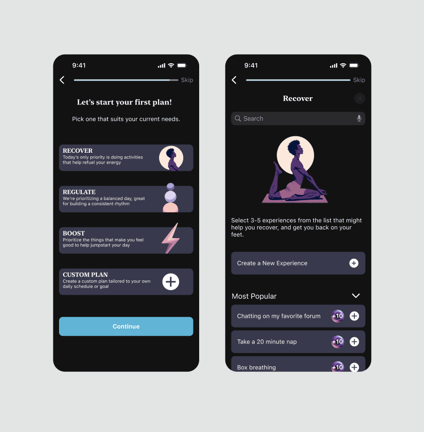
'Gamify' the onboarding via storytelling
Inclusivity and Accessibility ups the experience
Streamlined interfaces with essential information available
Personalization features positively impact the UX

Additional External Research Conducted
Reddit forums to understand neurodivergent primary accounts
Scholarly articles discussing neurodivergent burnout
Scholarly articles discussing intrinsic v. extrinsic motivation
Scholarly articles discussing reactionary cognition behind energy accounting
Blog postings for primary accounts
II. Synthesis
Based on our user feedback, our team identified several trends that highlighted a need for posi. These points included a desire to be held accountable, being intrinsically motivated, and an openness to discovering an application that would account for energy throughout the day.


Personas were created with the basis of embodying two specific types of users: those who experience burnout, and those seeking to prevent it from occurring. One of our users, Alex, was born out of the former, as they are seeking a way to regulate their energy drainage that occurred following the completion of a recent creative project. Jamie, in contrast, is a detail-oriented individual who is feeling the onset of burnout and wants to take preventative measures. Jamie is organized and habitual, however struggles with the work-life balance and wants to have gradual habit changes.

Journey Mapping
When I was creating the journey map, I wanted to accurately predict the emotional upheaval that Alex would endure. For one, their energy begins at an extreme low, and they have little energy to experience a laborious onboarding process. However, the more that they learn about the commonness that is neurodivergent burnout, the more eager they become to discover and interact with posi’s interface.
Our wireframers, Eric and Yoon, created a task flow that outlined the necessary steps that each of our personas would need to take to achieve their intended goal. Alex’s task flow depicts a first-time user’s onboarding and dashboard experience. Jamie’s task flow begins as an already-existing user of posi, and theorizes that they are outlining their daily plan, as well as checking out other pages for the sake of discovery.
III. Sketching and Ideation


Gamification
Our client had mentioned that they would like an element of gamification within Posi. We tinkered with ideas of creating a character to walk through onboarding and help throughout the application, while other ideas were thrown out of having a virtual pet to take care of. Calcifer was a well-appreciated inspiration for “feeding the flames’ of energy, with Calcifer hanging onto his log when energy was not granted, however, there were questions with trademarks and legality of using an already-created character.
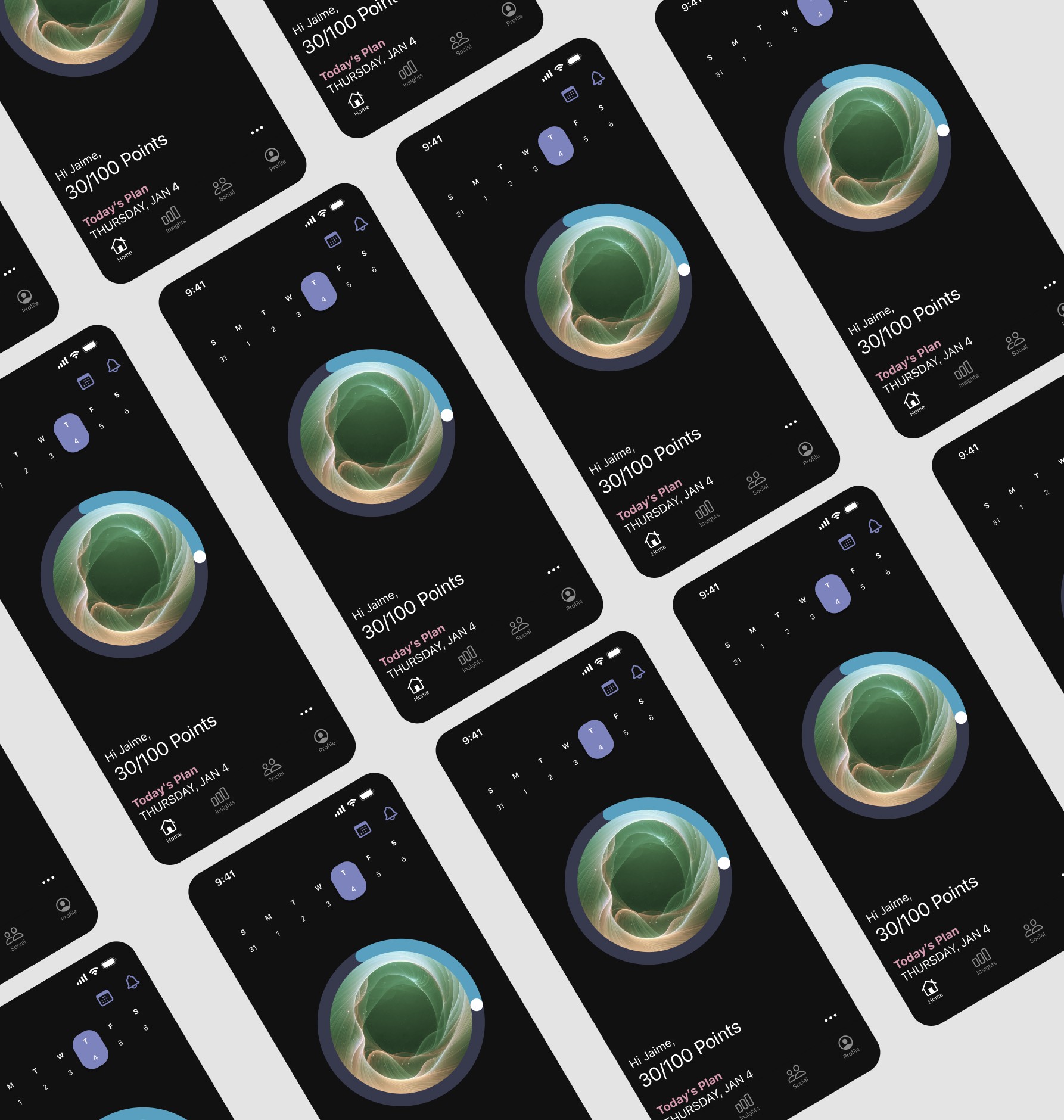
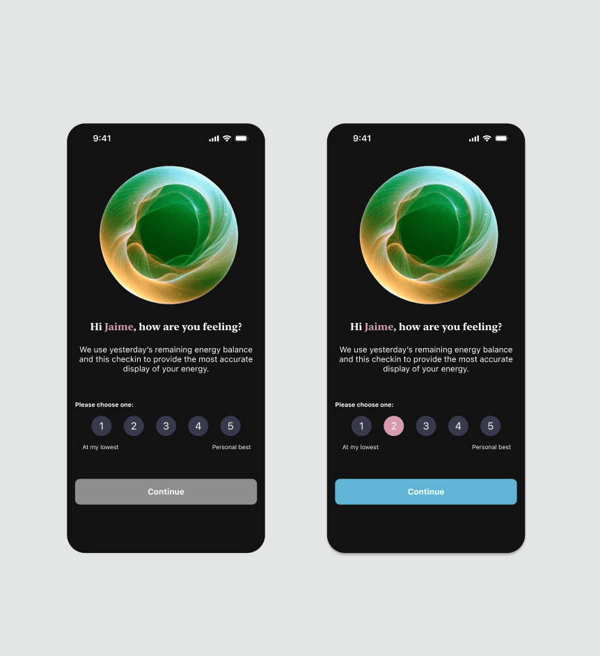
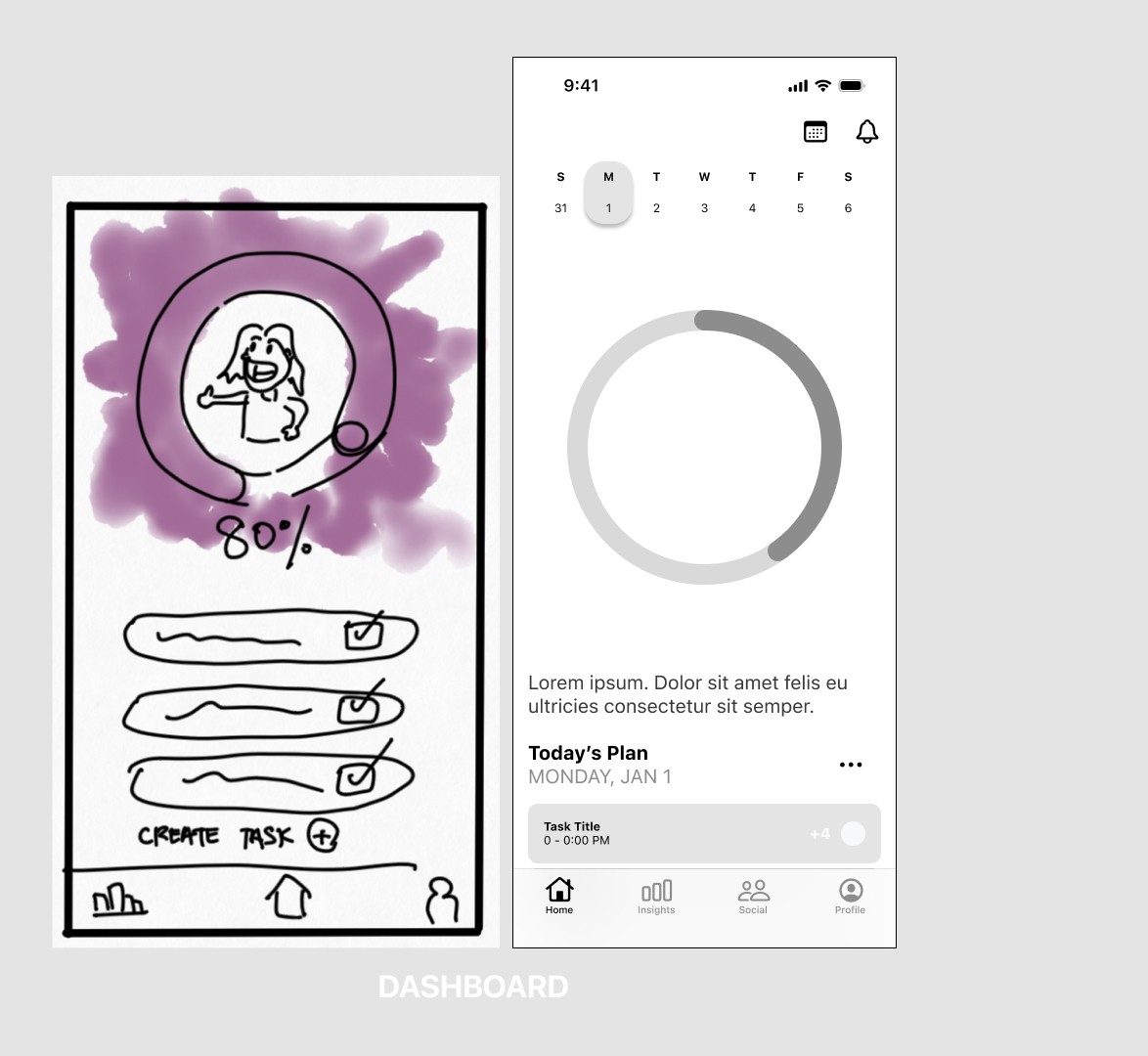
Upon viewing the application in ‘dark mode’, it brought a level of sophistication that didn’t match a character, but instead I introduced the idea of a living, breathing aura that would be encouraged by energy deposits. This seemed like a fluid marriage between gamifying the application, and having some form of accountability by taking care of a character.
Branding
Our approach on branding was a synergy between meeting our client’s needs and maximizing accessibility for our users. Our client had gravitated towards hot pinks, fun sapphire blues, and bright greens, whereas our neurodivergent users, as per survey responses and external research indicated that muted versions of colors evoke calmness and serenity, which we intended with the application. Our resident branding expert, Nolan, developed a style guide that included muted pink, periwinkle, and blue as our default colors, while individuals would have the ability to personalize their own app experience and use different colors suggested to them.
Sketching
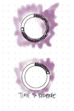
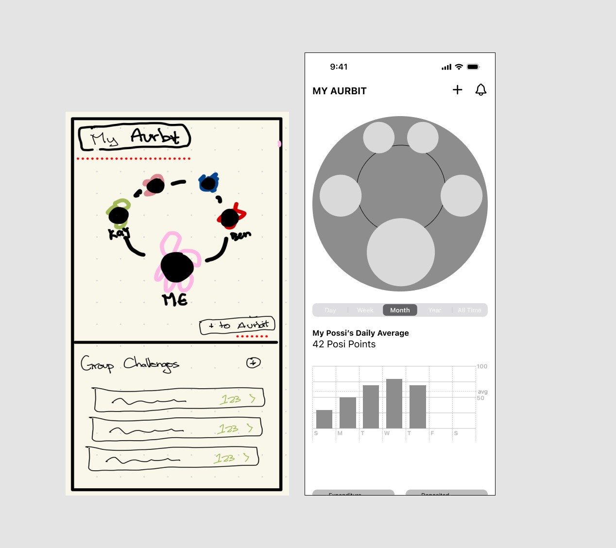
Sketching started from ground zero, so a great deal of time was spent iterating, particularly with the depiction of the dashboard. There were ideas to create a textured aura, and Eric created a beautiful watercolor sketch of an aura, while Nolan suggested that the aura would illuminate the greater that the aura became. A social function for the application was suggested by a team member, so I ran with my idea of an aura and created an “aurbit” – or an orbit of friends – that users can share with friends on the application.
Functionality
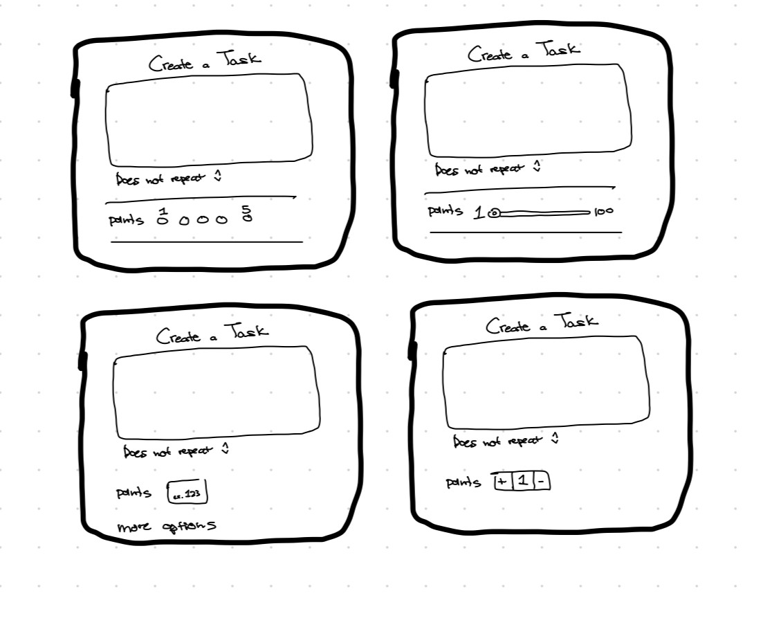
In initial discussions, my team’s method was to follow a proportional number, starting each individual with 12 spoons, and having tasks that can drain or gain up to 5 spoons. However, quantifiably, an onset of limitations and consequential questions followed – if Person B does 3 ‘gain’ activities that each costs 5 spoons, does that mean Person B is now over the limit of gains for the day? – or – what if Person C thought going to the grocery store would only cost 5, but it ended up costing 7 because they got into a scuffle with a store clerk? It seemed that there were quite a few questions that each minute decision came with, and ultimately we were unsure if the limitation was within our constraints or not.
IV. Mockups and Prototyping
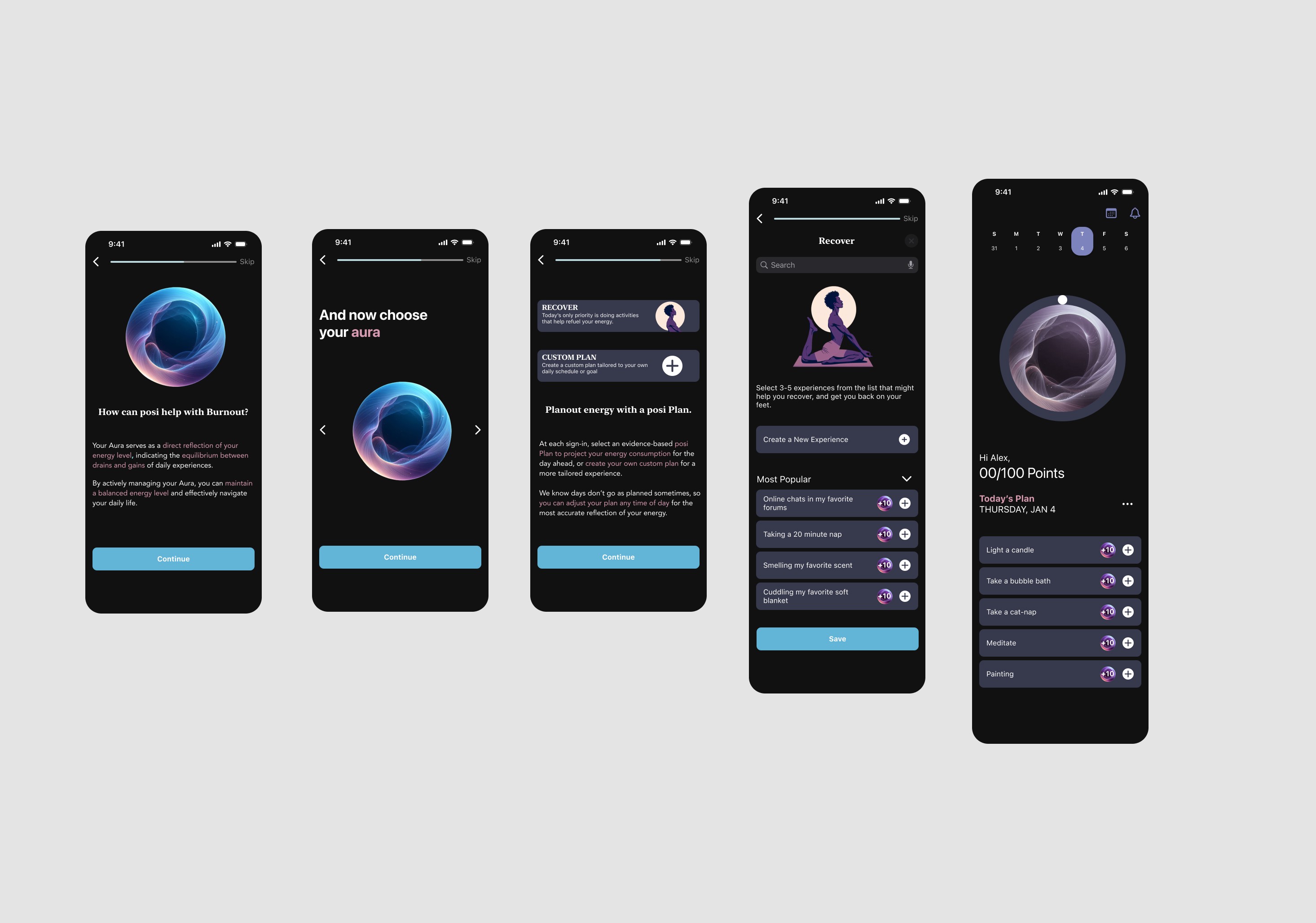
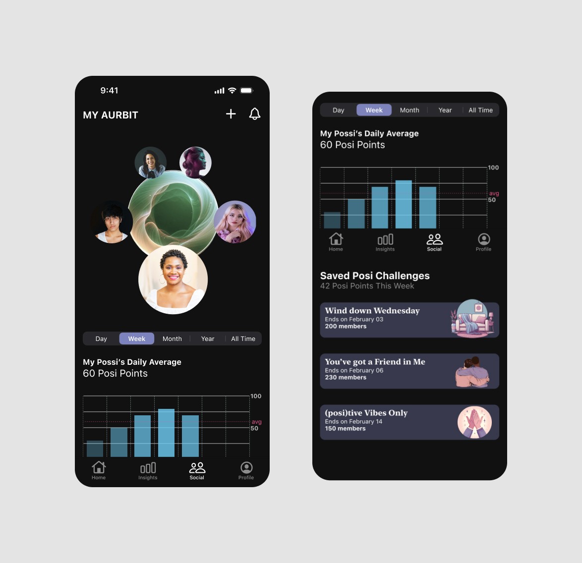
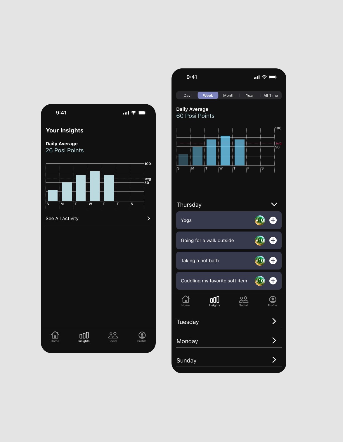
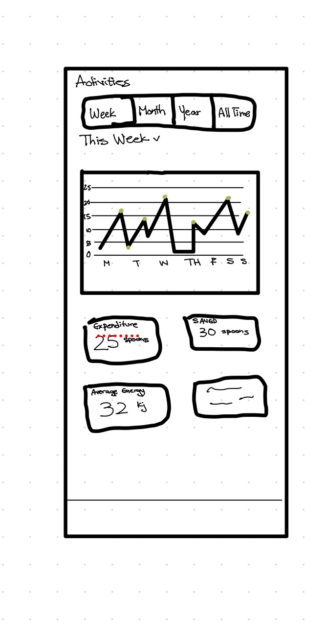
Ultimately, our decision ended with using 12 spoons as the default, and individuals would be able to assign points on a scale from 1-3, with each task being editable. This way, individuals could change the energy drain/gain if it was different than they projected. Our Hi-Fi also expanded on using color as a marker for energy accomplishment for the day; if the aura was demure and muted, it would indicate that there was a lack of sufficient activities, whereas a fully colored and bright aura would suggest that the individual was successful for the day. Additionally, visual cues such as a progress bar surrounding the aura, as well as verbal words were supplemental indicators of the individual’s current and projected progress for the day. Our hi-fis were a byproduct of the external and internal research conducted, and eventually landed us with beautiful wireframes and a functioning prototype.
V. Usability Testing and Next Steps

There were still a lot of questions left unanswered, however. The gamification, while foundationally created, did not include a rewards system, which our client had expressed interest in engaging in. The capabilities of the point system also has yet to be fully discussed, and Nolan had suggested instigating a rest/pause function, in case users don’t want to be using the app at all times and need a break from the energy accounting as well.
During usability testing, users responded well to the black background, color palette, and graphics, noting that it was visually appealing and calming to the eye. The main measurement of success I used was goal completion, in which our users were able to complete the first goal of onboarding within 2m 56s with 2 errors, and the second goal of exploring the application within 4ms with 0 mistakes. Despite being the measurement of success, I was intent on focusing on how intuitive the app itself was. Users found the onboarding process to be incredibly intuitive without being too distracting, however the plans were less intuitive than our team expected. Back to the drawing board! Our copy was finalized as explaining the why behind the plans, not just the what.